Color is a really powerful tool in design. But it can also be a debilitating one if you’re unsure of what colors you like and what works best in your space. Or maybe you’re worried about getting tired of anything bolder than white or wood tones. You’re not alone.
The good news is that this is a very common design dilemma, and a few simple designer tricks can make it easier to start embracing colors both inside and outside of your comfort zone. Get ready to color your world (at the very least, in small doses)!
If you’re hesitant to use bold colors, start with subtle shades and small touches
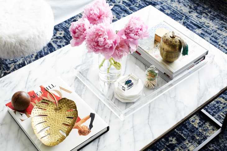
Color can be scary for a lot of people, especially when it comes to their homes. That’s because committing to a color on your walls or sofa requires you to invest in that shade and live with it day in and day out. It’s not like fast fashion, where you can donate or discard a cheapie dress or sweater if it’s not for you. Home decor decisions can be costly and time consuming, but color itself doesn’t have to be drastic to be impactful. “What clients might not realize is that color is really all around us and can be very subtle and feel like a neutral still,” says Christine Markatos Lowe of Christine Markatos Design . “For example, pale blush tones or steely grays feel like neutrals but are much more interesting and create a warmer atmosphere than stark white.”
Another way to take a baby step towards using more color is by trying out colored decorative accents—accessories, artwork, pillows, a throw. “You can move on to larger commitment items later,” says Donna Mondi of Donna Mondi Interior Design . If you aren’t sure what kind of colors you’d like to live with, search for some inspiration in your closet. Chances are, the colors you gravitate towards wearing are the ones you’ll be most comfortable surrounding yourself with.
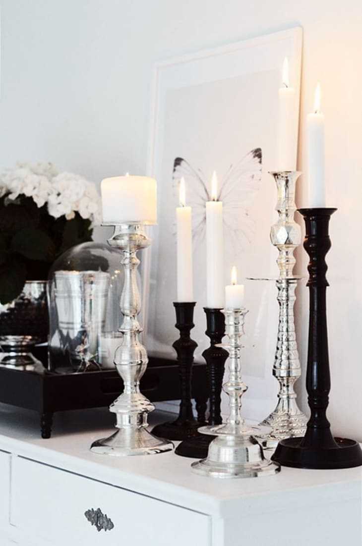
White is a color, and it doesn’t have to feel clinical
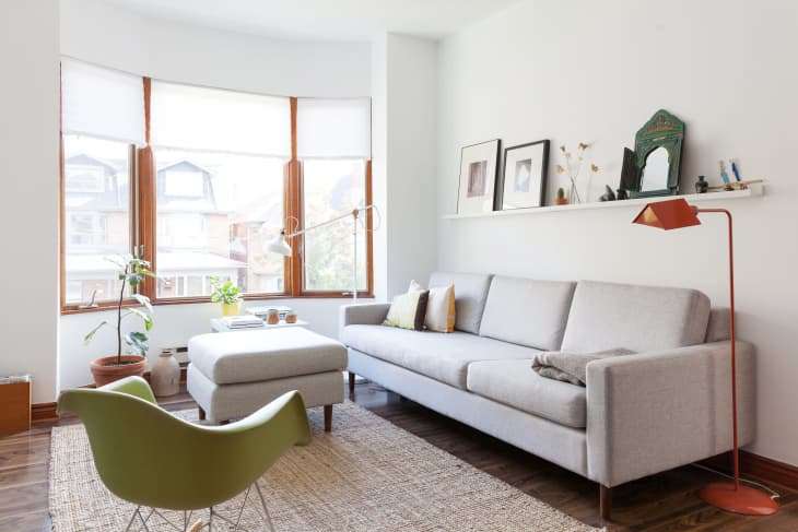
White has been having a major moment in home design for the past couple of years. It really is a great blank canvas for colorful art, textiles and accessories. But for those who don’t embrace color in their homes, white can be a little lifeless—that is, unless you learn to mix it up tonally.
According to Donna, white interiors need a variety of contrasts and textures to keep them from looking sterile. “Playing with shades of white, cream and gray while also mixing up the textiles with faux furs, natural wovens, rich velvets, linens and wools will guarantee your space won’t be boring,” she says.
Birgit Klein of Birgit Klein Interiors likes to use creams, taupes and whites with warmer undertones, as they create softer, more inviting spaces. “I love to punctuate a cream palette with a pop of color, like a warm purple or coral, then pair it with gold accents,” says Birgit. “Usually when clients see a pop of color, they want to extend that color through other rooms.”
Choose colors that work with the mood you’re trying to create
All colors aren’t created equally, at least when it comes to your walls. The color(s) you choose really envelope you and project a certain feeling depending on their hue.
Take fiery reds, which are high energy. You might not want this hue in a bedroom, for example, because it’s not as serene or visually calming as, say, a mint green, light gray or powder blue. Lots of designers like yellow as an accent in the kitchen because it’s bright and cheery, and this room is where a lot of people officially wake up and start their days. Blacks and navies are very dramatic, which makes sense if you want a moody or romantic room. In addition to the feeling you’re trying to create in a space, how much natural light a given room gets must also be factored into color choice. You shouldn’t go really dark in a windowless room if you aren’t trying to create a cave-like atmosphere, for instance. And whites can be tricky. Some rooms can handle cool pure whites, but most are better off with something off-white that has warmer undertones. Swatching is super important—best if you can paint largish squares on all your walls and check the color throughout the day to see how it might change depending on light, both natural and artificial.
Color plays a big role in pattern mixing
Pattern mixing can be tricky, but when you pull it off properly, a room really sings. According to Donna, the first step involves keeping a similar color palette when mixing patterns. Scale is also important. “The larger scale fabrics work best on larger items like a sofa or curtains, while the smaller prints are great for slipper chairs and pillows,” she says.
Christine agrees and takes the concept of color and pattern play even further, suggesting that having a lighter and darker ground pattern in the mix is what helps keep items from competing with each other. That’s basically why this dining room, shown above, she designed works. You have shades of blue and green that play well together (and repeat throughout the room), with a lighter ground zig zag wallpaper and a coordinating, darker ground mandala print drapery.
Go big if you’re ready for something bold
So far the advice given here has been aimed at the color shy. But for people that do want bolder colors, Christine says blues and greens seem to go with almost any style and are pretty gender neutral.
Donna, on the other hand, suggests that her color-loving clients paint a whole room any dramatic shade that they gravitate toward so long as it works with the architecture of their space. You also should balance out the intensity with the furnishings. “Offset that with some neutrals and you won’t regret it,” she adds.